IMPACT
WCAG
compliance, improving accessibility across all platforms
25%
increase in design and development workflows

The challenge
At Bershka, each product vertical was developed by separate teams, each with its own components, rules, and ways of working. This led to duplicated components, inconsistent interactions, and fragmented user experiences.
The project was initially kicked off by my teammate Mike, who laid the groundwork for the system. I joined shortly after to help solidify the foundations, expand the component library, and drive adoption across product teams.
Collaborating with a dedicated, cross-platform engineering team was a game changer — it ensured feasibility and consistency from design to code.
Starting from the ground up
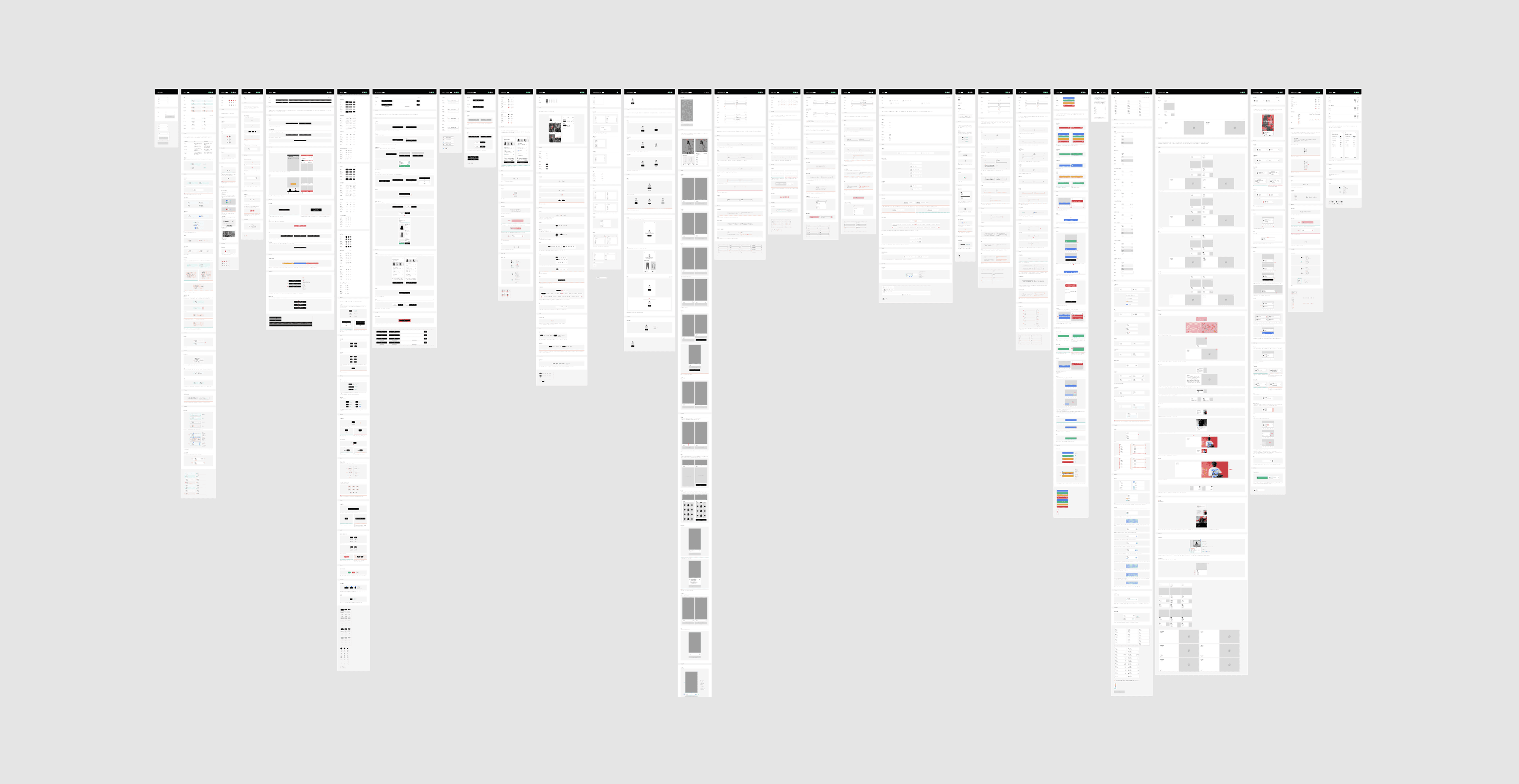
Before designing, we audited. We reviewed over 20 main components in Figma and code, interviewed designers and developers, and mapped duplications and missing patterns.
This helped us build a system that was realistic, prioritized, and aligned with how teams actually worked.

Creating a shared language
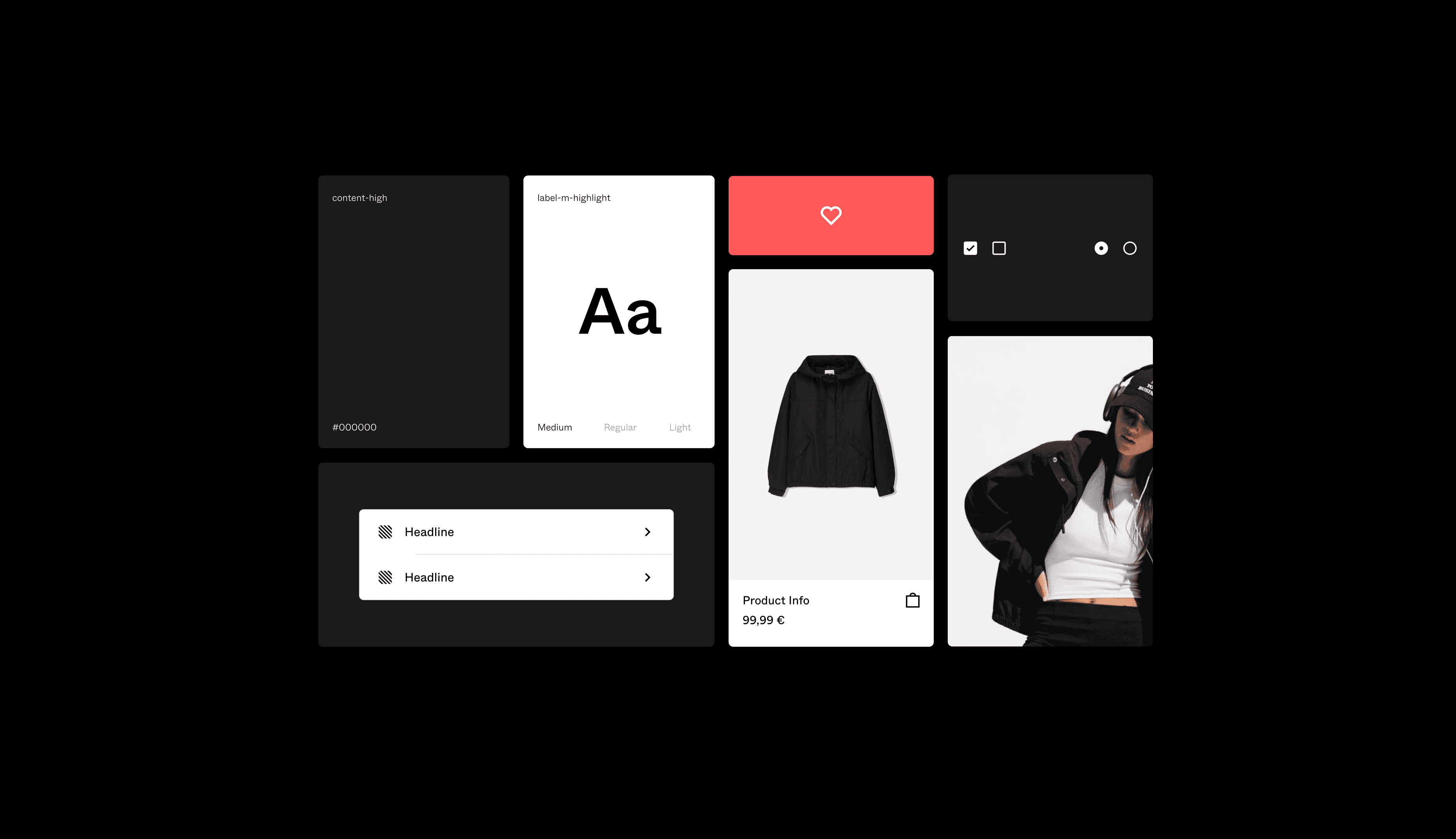
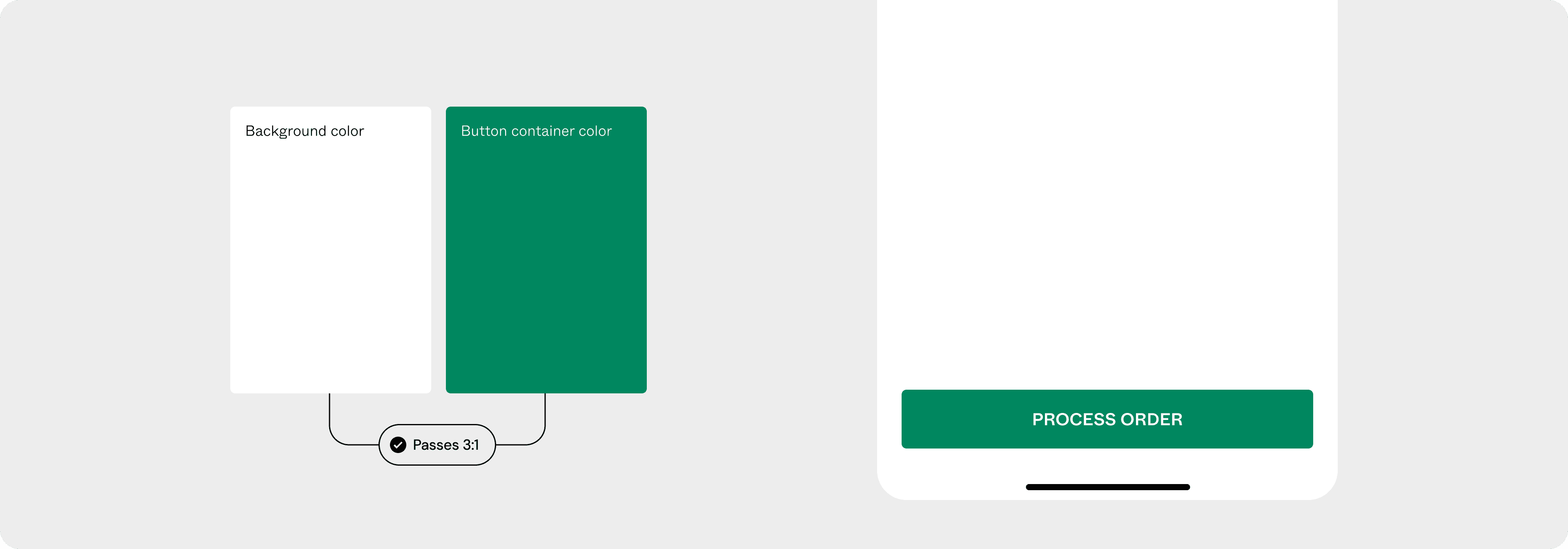
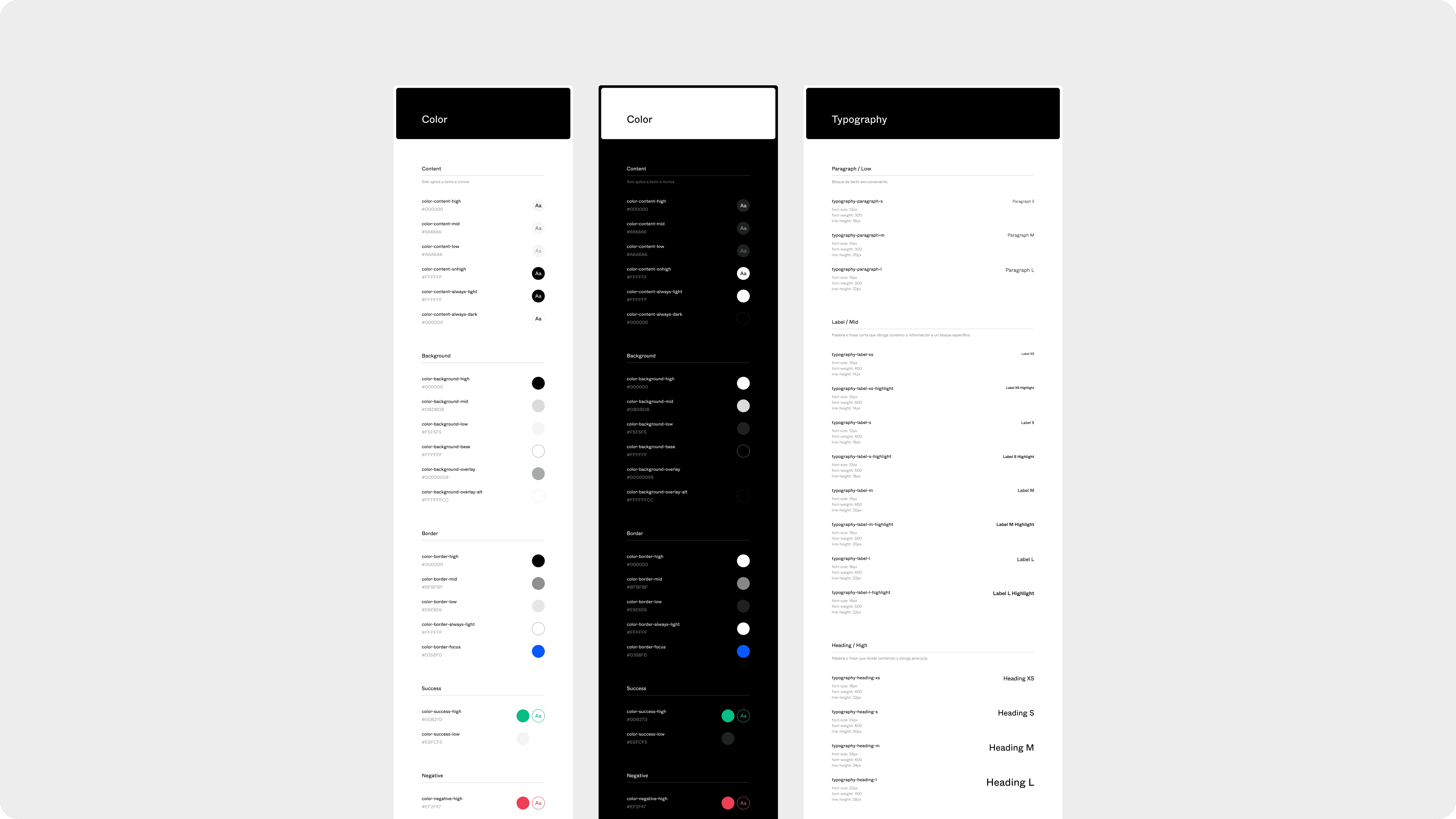
We established a robust foundation of design tokens: colors, typography, spacing, grid, elevation. Every decision was made for long-term scalability and accessibility, meeting WCAG AA guidelines from the start.
However, our first accessible color proposal was rejected. Later, when the new European accessibility legislation came into force, we had to revisit and adapt the system. A real reminder that accessibility isn’t optional or a final step — it must be embedded from day one.

Connecting design, development… and people
We built the Figma component library as a living language: including variants, states, documentation, and usage guidelines. A single source of truth — scalable, easy to understand, and ready for new teams.
Beyond design, I worked closely with developers to integrate the system via Storybook and implement testing tools. I also ran internal sessions and shared best practices to promote usage and ensure the system was embraced — not just implemented.
The impact
The implementation of the BSK Design System brought measurable and strategic benefits across teams:
Faster delivery cycles thanks to a shared library — design and dev could work in parallel with fewer handoffs and misalignments.
81% of the components used in core user flows were replace by the new system. This ensured a unified, more consistent user experience across platforms.
Improved accessibility by default, as core components followed WCAG AA contrast and interaction guidelines, setting a new baseline for inclusivity.
The design system became a strategic asset, enabling Bershka to scale features, seasonal campaigns and product releases more efficiently — without reinventing the wheel each time.
Learnings
Adoption is Everything
Success isn’t about how many components you build — it’s about getting real consistency in production. Documentation, training, and clear communication helped us create a system people understood, trusted, and wanted to use.
Involve Developers Early
Collaboration with engineering can’t wait until the end. Involving devs from the start helped us create components that were technically feasible, scalable, and accessible — and ultimately shipped.
Accessibility Is a Principle, Not a Phase
We initially proposed an accessible token base, but it was rejected. When EU regulations changed months later, we had to backtrack and adjust parts of the system. This experience taught me a core truth: designing for accessibility from the start saves time, avoids waste, and creates better experiences for everyone.